Differences in Design Styles
 A few weeks ago, one of my colleagues came across Intacto’s flatvsrealism.com, a beautifully animated, interactive battle between two polar opposite design styles currently in play across websites and graphical interfaces everywhere. We featured the site on Facebook recently and found it addressed the two distinctly different trends in a fresh and unique way.
In earlier days realistic design (or skeuomorphism) evolved to assist users in identifying the purpose of an interactive element or where to click in an interface. The detail used in skeuomorphism gives graphics a polished look while also somewhat mimicking actual materials. Lately, flat design is all the rage – especially after being adopted by major players like Microsoft and Apple. With flat design, we have witnessed a return to basics of form, color, and use of space. It is clean, simple, modern, and colorful. So is this movement towards flat design a fad or are there clear benefits to the flat style beyond trendy modern aesthetics?
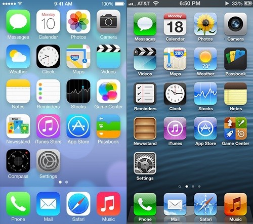
Apple’s move to flat design.
Flat design is actually preferred by developers and designers for key reasons. First, the production time is minimal, with little need for illustration. Added illustration work in skeuomorphism causes major delays in the design and development process. Load times for flat graphics tend to be less than for realistic ones. Stylesheets and entire websites can render faster using flat graphics. With minimal flat graphics, content is cleaner and can be presented more clearly. Flat graphics also cooperate more with responsive design, a trend that is certainly here to stay.
Not all is perfect in the flat realm. Skeuomorphic design elements can guide the viewer more clearly to action objects. They also convey a sense of refinement not seen in more simple flat designs. I have a friend who ranted for weeks about the “cheap” look of his iPhone icons so I have experienced flat design hatred first hand. In the end, a lot of people are more comfortable and familiar with skeuomorphic style design elements because they look real, not just like shapes and symbols. A pencil looks more like a real pencil. A calculator looks more like a real calculator.

Cartman isn’t crazy about his makeover.
We are already seeing articles, tweets, and posts stating that flat design is over. The new post-flat design phase will no doubt see the two styles converging where the simple efficiency of flat design will take on more subtle textures, shading, and detail. Still, given the benefits to the design and development process you can bet that flat design elements are here for the long haul.
So who wins the battle between flat and realism? Ultimately it boils down to a matter of taste and in the end, what matters most is that good design principles and design elements allow for an excellent user experience.
Orlando Website Design
At authenticWEB, we tend to use a mixture of realistic and flat design elements depending on a) what our client wants and b) what is actually best for the client’s business. Our talented multimedia designers can create the perfect marriage of design elements for your business’ website. Our top priority is authentically and consistently telling your story through cohesive website design, SEO, social media, and online video.